Container
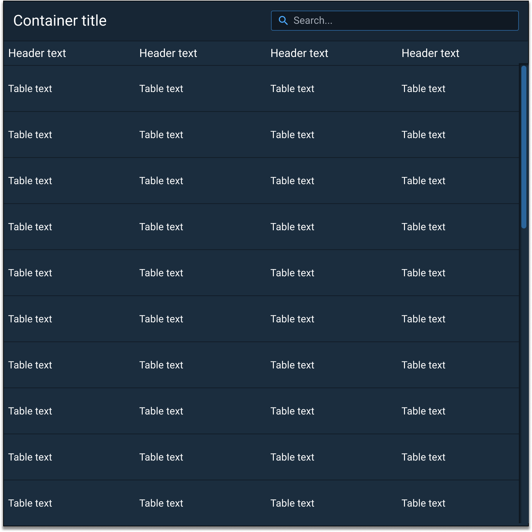
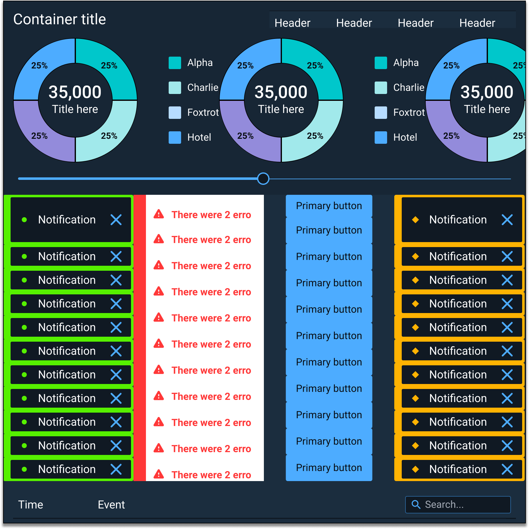
Containers are used to group multiple components into a specific area that allows them to flow in a flexible/responsive manner. Containers can be used to help effectively manage lists, tables, dialogs, modals, slide out panels, content containers (top and bottom), and other components.
Appearance and Behavior #
Containers have sections for a header, a tab bar, a toolbar, body content, and a footer.
The Container component uses an optional drop shadow that can help distinguish it from other UI elements (e.g. applied in “overlay” situations, such as dialogs and slide-in panels).
Child containers (smaller Containers meant to reside inside of a larger Container) consist of a header, room for custom content on the left and right of the header text, and body sections. The body section can be used as a canvas to freely overlay multiple components.
Examples #


